# Stylus

sass是需要额外安装Ruby环境才能编译的。- 稍晚两年出现的
less优势是支持原生 CSS 语法从而 平滑过渡使用,但是其编程功能却不如sass强大。 - 选择使用
stylus,第一印象会觉得它语法相比sass或者less等都要简练,其实不仅如此,stylus相比其它两者而言是最年轻的,它于 2010 年产生,来自 Node.js 社区,所以和 NodeJS 走得很近,功能上也更为强壮,和 js 联系更加紧密,常用的变量、嵌套、继承、计算、条件、循环、混合、函数、穿透..等必备功能完全能满足,缺点也很明显,写法需要一定时间适应,学习曲线相对会比较陡峭。
# 配置
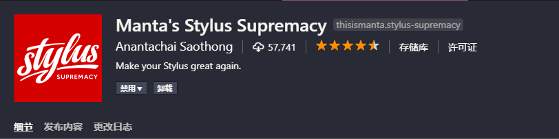
在 vscode 中有对应的支持插件,以下是我使用的相关首选项配置:
该插件支持直接将scss格式代码一键转换成stylus格式,但是语法需要手动调整,也可以借助sass2stylus在线工具进行转换。
{
  /*格式化stylus*/
  "stylusSupremacy.insertColons": false, // 是否插入冒号
  "stylusSupremacy.insertSemicolons": false, // 是否插入分号
  "stylusSupremacy.insertBraces": false, // 是否插入大括号
  "stylusSupremacy.insertNewLineAroundImports": false, // import之后是否换行
  "stylusSupremacy.insertNewLineAroundBlocks": false // 两个选择器中是否换行
  // ....
}
1
2
3
4
5
6
7
8
9
2
3
4
5
6
7
8
9
# 示例
stylus 语法:
// 背景图片
bg-image($imgName)
  $image2X = './images/' + $imgName + '@2x.png'
  $image3X = './images/' + $imgName + '@3x.png'
  width image-size($image2X)[0]
  height image-size($image2X)[1]
  background-image url($image2X)
  background-repeat no-repeat
  background-size contain
  $media (-webkit-min-device-pixel-ratio: 3), (min-device-pixel-ratio: 3)
    background-image url($image3X)

// 引用
$import '~assets/stylus/mixin'
.icon
  bg-image('icon-home')

// 穿透
.detail >>> .el-input__inner
  height 48px
1
2
3
4
5
6
7
8
9
10
11
12
13
14
15
16
17
18
19
20
2
3
4
5
6
7
8
9
10
11
12
13
14
15
16
17
18
19
20
sass 语法:
// 背景图片
@mixin bg-image($imgName) {
  $image2X: './images/' + $imgName + '@2x.png';
  $image3X: './images/' + $imgName + '@3x.png';
  width: image-width($image2X);
  height: image-height($image2X);
  background-image: url($image2X);
  background-repeat: no-repeat;
  background-size: contain;
  @media (-webkit-min-device-pixel-ratio: 3) and (min-device-pixel-ratio: 3) {
    background-image: url($image3X);
  }
}

// 引用
@import '~assets/stylus/mixin';
.icon {
  @include bg-image('icon-home');
}

// 穿透
.detail /deep/ .el-input__inner {
  height: 48px;
}
1
2
3
4
5
6
7
8
9
10
11
12
13
14
15
16
17
18
19
20
21
22
23
24
2
3
4
5
6
7
8
9
10
11
12
13
14
15
16
17
18
19
20
21
22
23
24